> x <- c(1,2,3,4,5,6,7,8,9)
> summary(x)
Min. 1st Qu. Median Mean 3rd Qu. Max.
1 3 5 5 7 9
I explained the meaning of quartile last post.
This time, I will explain the box-whisker plot using above information. It is going to be very fun this time because we can learn how to visualize data set so that we can interpret data set more easily.
First, why don't we focus on the Max, Min result of summary.
Let me skip these two because Minimum or maximum values are commonly used in our daily lives,
Last one is I didn't explain is average.
This is one of the most common statistic and I believe everybody knows about this.
However, average itself is not an appropriate value to judge a measure of dispersion.
I will introduce the meaning of variance and standard deviation next post.
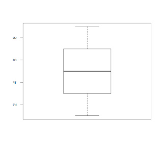
Anyway, I think we are ready to draw a box-whisker plot.
As you can see , bold line in the box one the middle tells you the median value (second qualtile) and this box range between first qualtile and third qualtile.
Lastly, 2 lines connected to dotted line means the maximum and minimum value.
Box and whisker plot is a useful graph to understand whole data set intuitively.
> boxplot(x)

댓글 없음:
댓글 쓰기