When it comes to the R, no doubt, you will be hearing that one of the most powerful functions in R is graphic support. Of course, I feel the same way, too.
Today I will talk about some of R graphic functions and I will discuss more detail one more time.
I am going to use trees data which is built-in sample data for our demonstration.
> trees
Girth Height Volume
1 8.3 70 10.3
2 8.6 65 10.3
3 8.8 63 10.2
4 10.5 72 16.4
5 10.7 81 18.8
6 10.8 83 19.7
7 11.0 66 15.6
8 11.0 75 18.2
9 11.1 80 22.6
10 11.2 75 19.9
11 11.3 79 24.2
12 11.4 76 21.0
13 11.4 76 21.4
14 11.7 69 21.3
15 12.0 75 19.1
16 12.9 74 22.2
17 12.9 85 33.8
18 13.3 86 27.4
19 13.7 71 25.7
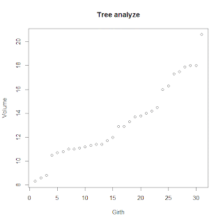
As you can see, there are three columns. If you want to analyze the relations between
Girth and Volume.
> plot(trees$Girth, trees$volume, main="Tree analyze" , xlab ="Girth", ylab="Volume")
(default type is point graph, try other type of graph by adding type="b" .. (dotted line graph, line graph etc)
You might be want to see the frequency of height. you can use the barplot.
barplot(table(trees$Height), main="Tree Height analyze" , xlab ="Height", ylab="Meter")
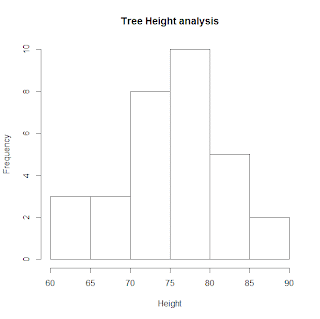
Another way to see the frequency of the data is hist function.
hist(trees$Height, main="Tree Height analyze" , xlab ="Height")
Which one do you think better? It's up to you.
I said, R has diverse graphic support.
This is one of the most favorable functions in R, you can add additional line to improve graph readability.
I would like to see the trees their height is above average. how can I do this ?
> barplot(trees$Height)
> abline(h=mean(trees$Height), col="red")
Finally, I introduce one more basic graph, pie chart.
Pie chart displays proportional data intuitively. For example, you might be want to see the height in terms of a large percentage. not a individual percentage.
Then first divide data into appropriate group.
> a <- mean(trees$Height[trees$Height < 70])
> b <- mean(trees$Height[trees$Height < 80 & trees$Height > 70])
> c <- mean(trees$Height[trees$Height > 80])
and then put in an another variable and give a name to each group.
> names(rate) <- c ("Under 70","Between 70 and 80","Beyond 80")
> pie(rate)
How about your feeling ?
Are you going along with my idea that R has a powerful graphic support ?


댓글 없음:
댓글 쓰기